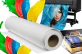




Innerspark.us – Metallic and pearl archival art papers are specialized photographic substrates designed to enhance image depth and luminosity through embedded mica particles, making them ideal for high-contrast, vibrant, and industrial-themed prints. Choosing between them depends on whether you seek the high-gloss, three-dimensional “wow” factor of metallic finishes or the subtle, sophisticated luster characteristic of pearl surfaces.
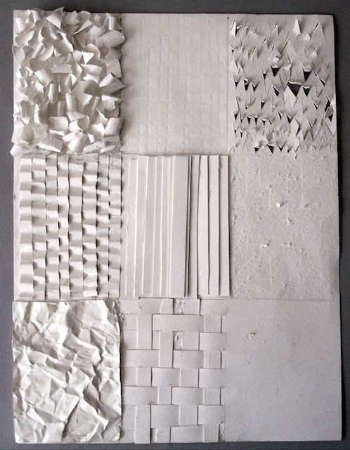
📷 Photo by uk.pinterest.com
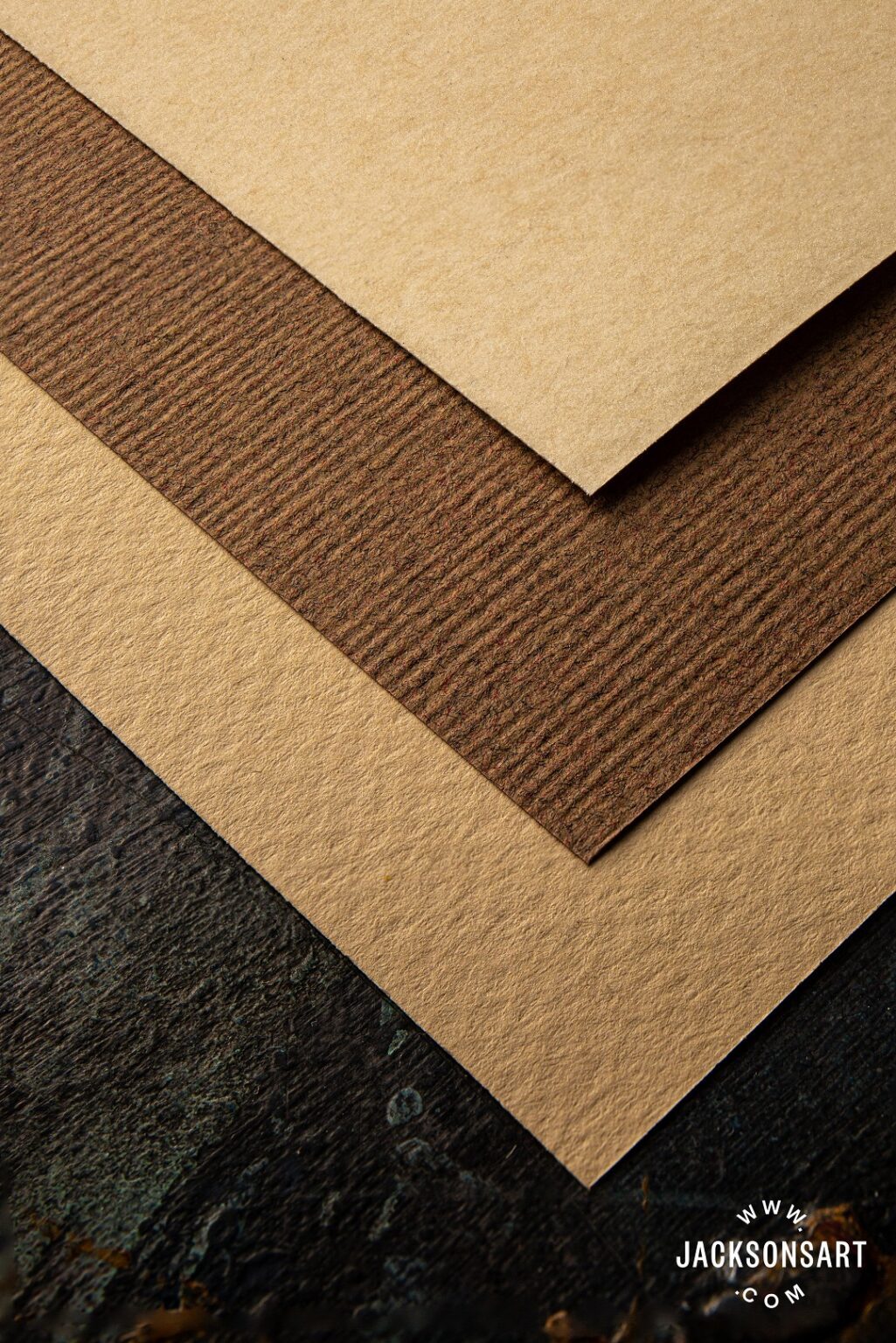
📷 Photo by jacksonsart.com
The evolution of digital printing has moved far beyond the standard matte and glossy options that dominated the industry for decades. For artists, photographers, and print-on-demand professionals, the selection of substrate is often as critical as the composition of the image itself. Metallic and pearl finishes represent the premium tier of archival papers, offering a unique tactile and visual experience that can elevate a standard photograph into a gallery-quality piece of art.
Understanding the Technology Behind the Finish
At their core, both metallic and pearl papers utilize a unique coating layer infused with microscopic minerals, typically mica or pearlescent crystals. These particles are responsible for the way light interacts with the print. When light hits a metallic paper, it reflects off these particles in a way that mimics the look of a print on brushed aluminum or chrome. This creates an effect where the image appears to have internal luminescence, often referred to as a “3D effect.”
Pearl finishes, on the other hand, are more restrained. They offer a softer, more satin-like transition. The pearlescent coating provides a slight shimmer that does not overwhelm the subject matter. While metallic papers can sometimes distract from delicate skin tones or soft landscapes, pearl papers act as a bridge, offering the benefits of archival longevity and high dynamic range without the aggressive reflectivity of a full metallic surface.
When to Choose Metallic Archival Paper
Metallic paper is the heavyweight champion for high-impact imagery. Its surface is typically high-gloss and features a base that is engineered to maximize contrast and color saturation. Because the surface is highly reflective, it excels in environments with controlled lighting, such as a gallery or a well-lit studio.
You should reach for metallic paper when printing high-contrast black and white photography, industrial architecture, or automotive shots. The metallic finish adds a crispness to the highlights that makes chrome, glass, and steel pop off the page. It is also an excellent choice for vibrant, saturated color photography, such as neon street scenes or underwater photography, where the “glow” of the paper enhances the artificial or aquatic light.
When to Choose Pearl Archival Paper
Pearl paper—often interchangeable with “satin” or “lustre” in some manufacturing contexts—is the versatile choice for professional portraiture and wedding photography. It provides a sophisticated finish that minimizes glare while still offering a noticeable sheen. The primary advantage of pearl paper is its ability to handle skin tones with grace. Unlike metallic paper, which can make skin look overly shiny or artificial, pearl paper provides a smooth, elegant texture that feels premium to the touch.
If your work involves fine art portraits, bridal photography, or nature landscapes where you want a sense of depth without the “chrome” look, pearl is the superior choice. It is also more forgiving in less-than-ideal lighting conditions, as its texture helps to diffuse reflections that would otherwise obscure the image on a high-gloss metallic sheet.
Comparative Analysis of Finishes
| Feature | Metallic Finish | Pearl Finish |
|---|---|---|
| Reflectivity | High (Mirror-like) | Moderate (Satin-like) |
| Best Subject | Architecture, Metal, Neon | Portraits, Landscapes, Weddings |
| Contrast Levels | Extreme | Natural/Balanced |
| Glare Sensitivity | Very High | Low to Moderate |
| Tactile Feel | Slick, smooth | Textured, sophisticated |
Practical Steps for Preparing Your Files
Choosing the right paper is only half the battle; the digital file must be prepared to handle the unique characteristics of these specialized coatings. Follow these steps to ensure your prints reach their full potential:
📷 Photo by youtube.com
- Calibrate your monitor to ensure that the contrast and brightness levels you see on screen accurately represent the high dynamic range of these papers.
- Soft-proof your images using the specific ICC profile provided by the paper manufacturer to see how the metallic or pearlescent base will shift your color gamut.
- Adjust your levels, specifically in the mid-tones, as metallic papers tend to darken slightly during the printing process due to the heavy ink absorption required to maintain depth.
- Perform a small test strip, especially if you are printing a large-format piece, to confirm that the highlights are not “blowing out” against the shimmer of the paper.
- Allow for adequate curing time after printing; metallic coatings can be sensitive to handling immediately after coming off the printer due to the chemical composition of the ink-receiving layer.
Common Pitfalls and How to Avoid Them
One of the most frequent mistakes artists make is using metallic paper for images with subtle, low-contrast gradients. The metallic finish can introduce unwanted noise or “banding” effects in soft sky transitions or subtle skin shading. If your image relies on delicate, low-contrast detail, the shimmer of a metallic paper will likely fight against the image content rather than support it.
Another risk is the weight and fragility of the surface. Metallic papers are often prone to scratching if not handled with cotton gloves. Because the surface is so reflective, any fingerprint or micro-abrasion becomes immediately visible under gallery lighting. Always mount these prints behind non-glare museum glass or acrylic to protect the surface while maintaining the integrity of the finish.
Frequently Asked Questions
Q: Can I use standard inksets for metallic and pearl papers?
A: Yes, most professional pigment-based and dye-based archival inkjet printers work perfectly with these papers, provided you use the correct ICC printer profile for color management.
Q: Are metallic papers more durable than traditional matte art papers?
A: While they are highly archival in terms of lightfastness, the surface coating is more susceptible to physical scratching, so they require more careful handling and protective framing.
Q: Does the “metallic” effect look good for black and white prints?
A: It is arguably the best application for metallic paper; the silver-halide appearance provides a classic, darkroom-style depth that makes black and white images feel incredibly substantial and modern.
Ultimately, the decision between metallic and pearl comes down to the intended mood of the final output. If your goal is to create a bold, modern, and highly technical statement, metallic is the obvious choice. If you are aiming for a timeless, elegant, and high-quality finish that invites the viewer to look closer without being blinded by reflection, pearl will serve your vision far better. Both options represent a significant step up from standard photographic papers, provided you respect the unique requirements of their surface coatings.
📷 Photo by pinterest.com