






Innerspark.us – Calibrating studio lighting for art reproduction requires achieving a perfectly flat, flicker-free light source with a high Color Rendering Index (CRI) of 98 or above and an even distribution across the entire surface of the artwork. This process eliminates color casts and shadows, ensuring the digital capture perfectly matches the physical original.
Understanding the Core Requirements
The primary goal of art reproduction photography is technical accuracy rather than artistic interpretation. When you are photographing paintings, drawings, or mixed-media works, your lighting setup must be neutral. Any deviation in color temperature or intensity creates a ripple effect that makes post-processing difficult and inaccurate.
Most standard studio lights are designed for portraiture, where slight color shifts can be flattering. For art reproduction, these shifts are disastrous. You need a light source that maintains a consistent Kelvin temperature, typically daylight-balanced at 5600K. If your lights are inconsistent, your white balance will fluctuate between shots, leading to mismatched colors across a series of images.
The Importance of CRI and TLCI
📷 Photo by amazon.com
Color Rendering Index (CRI) measures how accurately a light source reveals colors compared to natural sunlight. For professional reproduction, a CRI of 95 is the bare minimum, but 98 or higher is the industry standard. Alongside CRI, look for the Television Lighting Consistency Index (TLCI). This rating is specifically designed for digital sensors, ensuring that the light spectrum does not cause unpleasant color shifts in the camera’s raw file processing.
Step-by-Step Calibration Process
Follow these steps to establish a calibrated environment for your studio sessions:
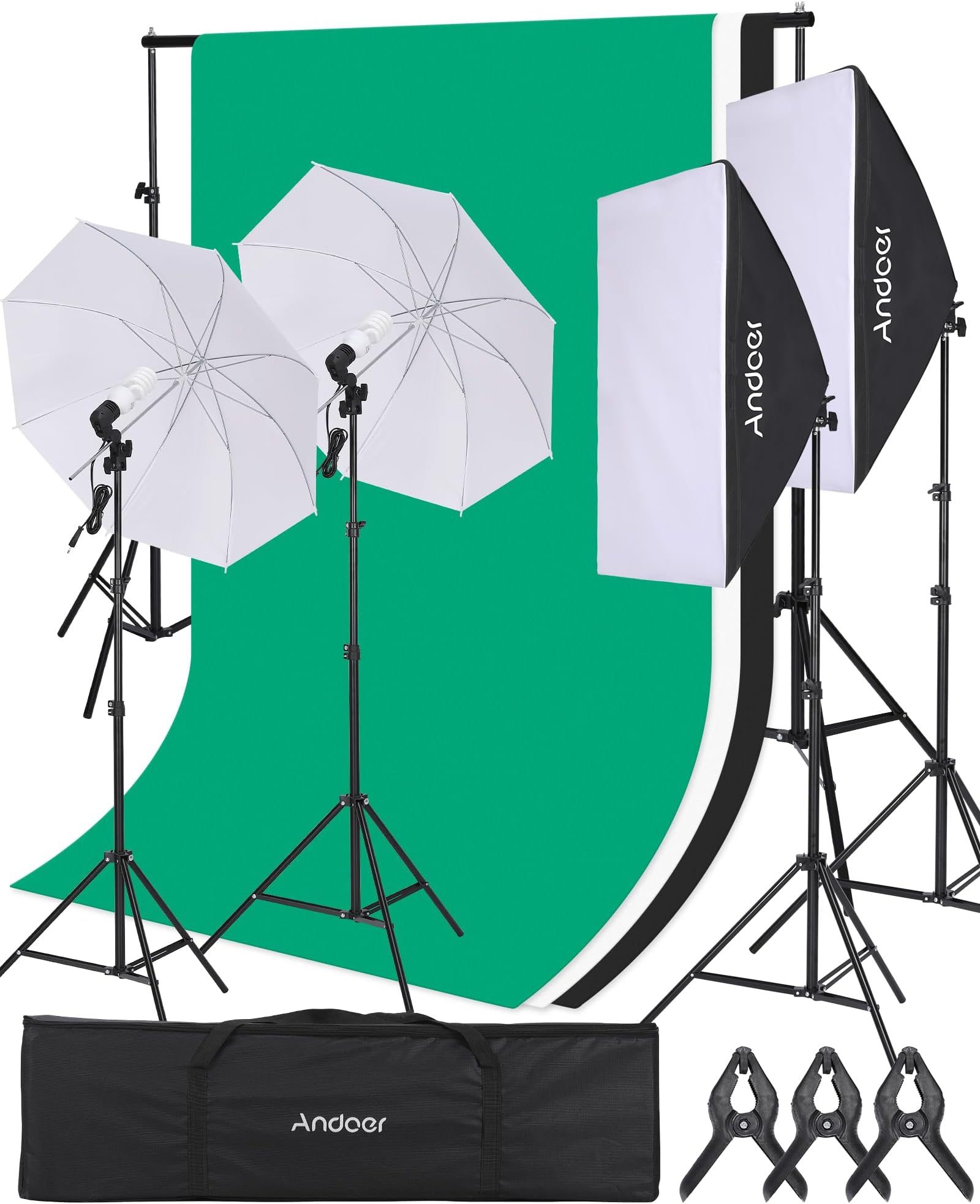
- Position your two light sources at 45-degree angles relative to the artwork. This angle prevents direct glare or hotspots from reflecting back into the lens.
- Use a light meter to check the intensity at the center and all four corners of the artwork. Adjust the distance of the lights until the variance is less than 0.1 stops.
- Set your camera to a manual white balance using a neutral 18% grey card or a dedicated color checker target placed in the same plane as the artwork.
- Use a polarizing filter on your lens in conjunction with linear polarizing film over your lights if you are dealing with heavily textured surfaces or oils that produce specular highlights.
- Take a test shot of a professional color calibration target, such as an X-Rite ColorChecker, to create a custom DNG profile in your editing software.
Equipment Comparison for Reproduction
| Feature | Standard LED Panel | High-CRI Reproduction Light | Tungsten Halogen |
|---|---|---|---|
| CRI Rating | 80-90 | 98-99 | 100 (Full Spectrum) |
| Heat Output | Low | Low to Moderate | Extremely High |
| Color Stability | Variable | High | High |
| Lifespan | Long | Long | Short |
Common Mistakes to Avoid
A common error is relying on “auto” settings. Never use auto white balance, auto exposure, or auto focus when shooting art. Once the lighting is calibrated, every setting on your camera must be locked. Even a slight change in the angle of the light can cause uneven shadows if the artwork has impasto texture or heavy brushstrokes.
Another frequent mistake is failing to control ambient light. Turn off all overhead studio lights, block windows with blackout curtains, and ensure that your floor and walls are painted a neutral grey or black. Stray light bouncing off a colored wall will introduce a color cast onto the artwork, ruining your calibration efforts.
Managing Specular Highlights and Texture
📷 Photo by amazon.com
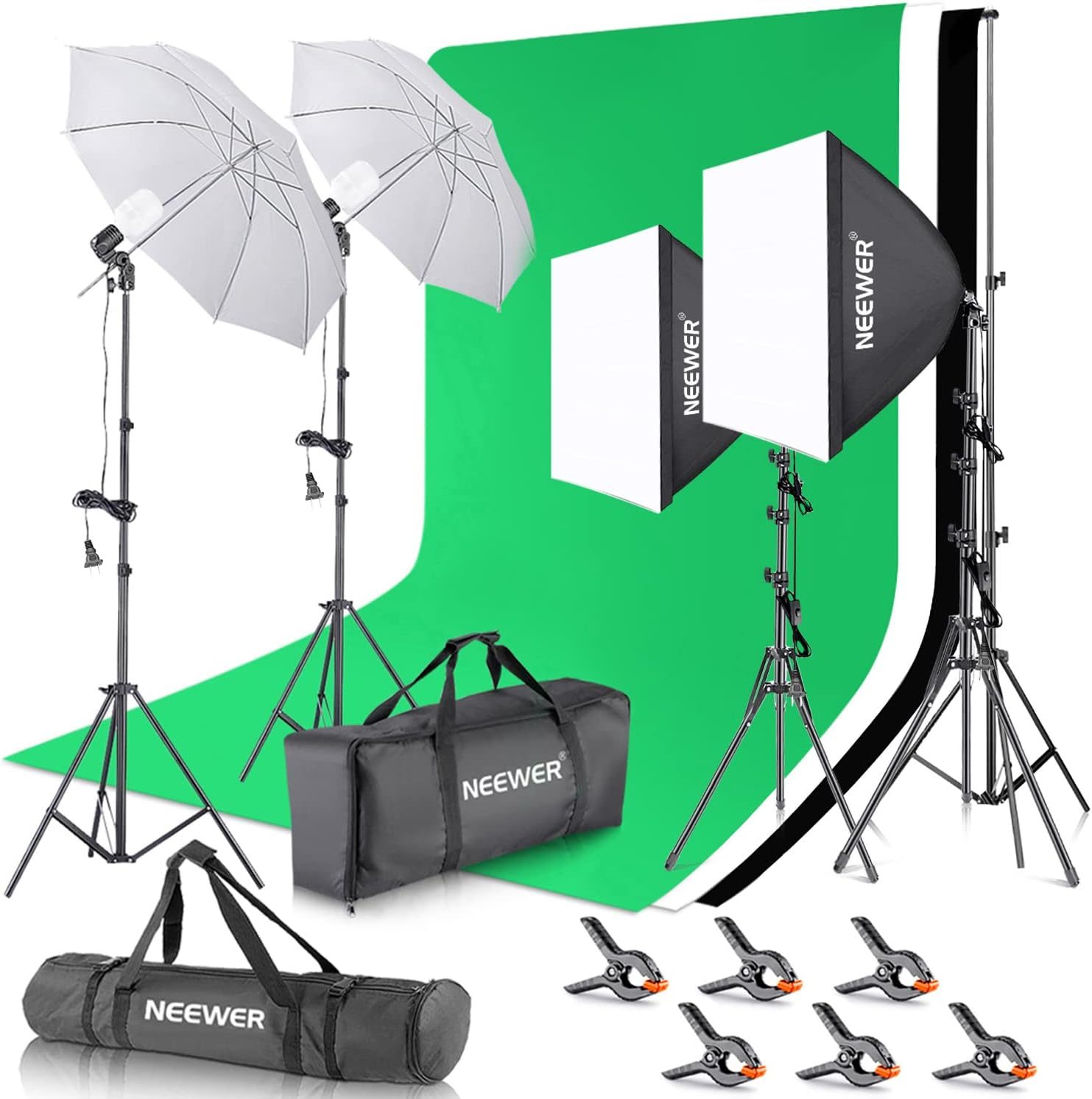
If you are shooting oil paintings with high gloss, light refraction is your biggest enemy. Even at a 45-degree angle, some light may catch the texture of the paint. Cross-polarization is the solution. By placing polarizing gels over your lights and a circular polarizer on your lens, you can rotate the filter to effectively “cancel out” the glare reflecting off the surface of the paint.
Always verify your results on a color-calibrated monitor. If your display is not calibrated, you are simply guessing at the final outcome. Your monitor should be set to a brightness level that matches your viewing environment, usually around 100-120 cd/m2, to ensure that you are not over-brightening your images during the edit.
The Role of Distance and Coverage
The inverse-square law dictates that as you move your lights further away, the fall-off becomes more gradual, leading to more even lighting across large pieces. However, this also reduces intensity. Find the “sweet spot” where your lights are far enough to provide uniform coverage but close enough to maintain a fast shutter speed, which reduces the risk of micro-vibrations affecting sharpness.
Frequently Asked Questions
Q: Why does my artwork look yellow even after calibration?
A: This is likely due to ambient light contamination or an incorrect white balance setting. Ensure all other lights are off and that you have captured a custom white balance using a neutral grey card under the exact lighting conditions you are using for the shoot.
Q: Do I need a strobe or a continuous light?
A: Both can work, but continuous LED lights with high CRI are generally easier for beginners to visualize the lighting. Strobes are beneficial if you need to use a very small aperture for maximum depth of field, as they provide high output without heat.
Q: How often should I recalibrate my lights?
A: If you are using high-quality LED panels, they remain stable for a long time. However, it is good practice to perform a quick meter check before every major project to ensure no bulbs have degraded or shifted in color temperature.
Final Thoughts on Consistency
True-to-life art reproduction is a game of consistency. Once you have established a workflow that yields accurate results, document your light distances, camera settings, and filter positions. By treating your studio as a controlled laboratory rather than a creative space, you ensure that every digital file you produce is a faithful representation of the artist’s original vision.
📷 Photo by justcreative.com