


Innerspark.us – The best color accuracy monitor for digital artists and photographers is the Eizo ColorEdge CG319X, as it provides hardware calibration, a built-in sensor for automated maintenance, and near-perfect coverage of Adobe RGB and DCI-P3 color gamuts.
Achieving professional-grade color accuracy is non-negotiable for creative professionals who rely on precise visual output for print or high-end digital display. A monitor that fails to represent colors accurately leads to distorted edits, mismatched skin tones, and disastrous print results. When selecting a display for color-critical work, the primary metrics are color gamut coverage, panel uniformity, and the ability to maintain calibration over extended periods.
Understanding Color Gamut and Delta E
Digital artists often focus on sRGB, but for professional photography and cinematic color grading, Adobe RGB and DCI-P3 are the industry standards. A high-quality monitor should cover at least 99 percent of Adobe RGB to ensure that the subtle greens and cyans in landscape photography are captured correctly. Furthermore, look for a Delta E value of less than 2.0. Delta E measures the difference between the color the monitor displays and the actual color in the file; the lower the number, the more accurate the monitor.
Key Considerations for Creative Displays
Beyond color space, screen uniformity is frequently overlooked. Many consumer-grade monitors have “backlight bleed” or variations in brightness across the panel, which can lead you to believe an image is brighter or darker than it actually is. Professional monitors feature Uniformity Equalization (UE) technology, which balances brightness across the entire screen, ensuring that a pixel in the corner has the same color temperature as a pixel in the center.
Comparison of Top Tier Color-Accurate Monitors
| Monitor Model | Primary Use Case | Color Coverage | Key Advantage |
|---|---|---|---|
| Eizo ColorEdge CG319X | High-end Print/Film | 99% Adobe RGB | Integrated Calibration Sensor |
| BenQ SW321C | Professional Photography | 99% Adobe RGB | Paper Color Sync Technology |
| Dell UltraSharp U2723QE | Graphic Design/General | 98% DCI-P3 | IPS Black Contrast Ratio |
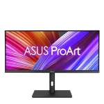
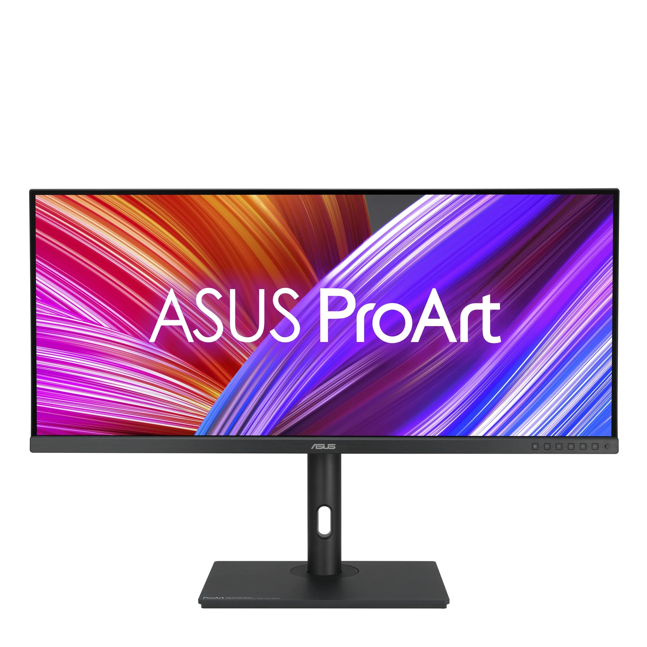
| ASUS ProArt PA329C | Video Editing/Illustration | 100% Adobe RGB | Factory Calibrated |
Practical Steps to Calibrate Your Monitor
Even the best monitor requires periodic calibration to combat the natural degradation of backlight components over time. Follow these steps to maintain color integrity:
- Warm up your monitor for at least 30 minutes before starting the calibration process to ensure the backlight has reached a stable temperature.
- Connect a professional-grade colorimeter, such as an X-Rite i1Display Pro or Calibrite Display Plus, to your USB port.
- Install the manufacturer’s calibration software, which allows the software to write directly to the monitor’s internal 3D Look-Up Table (LUT).
- Set your target brightness to 100-120 cd/m2 for print-ready work or higher if you are working in a brightly lit office environment.
- Run the calibration profile and save it as your system’s default ICC profile, ensuring that your operating system does not override these settings.
Common Mistakes to Avoid
One of the most frequent errors artists make is keeping their monitor brightness set too high. While a bright screen looks impressive, it creates a false sense of contrast and makes your photos look darker when printed or viewed on other devices. Aim for a brightness level that matches your ambient lighting. Additionally, avoid placing your monitor near a window where direct sunlight can wash out colors and create glare, which prevents your eyes from accurately perceiving shadow details.
Environmental Factors Influencing Color Perception
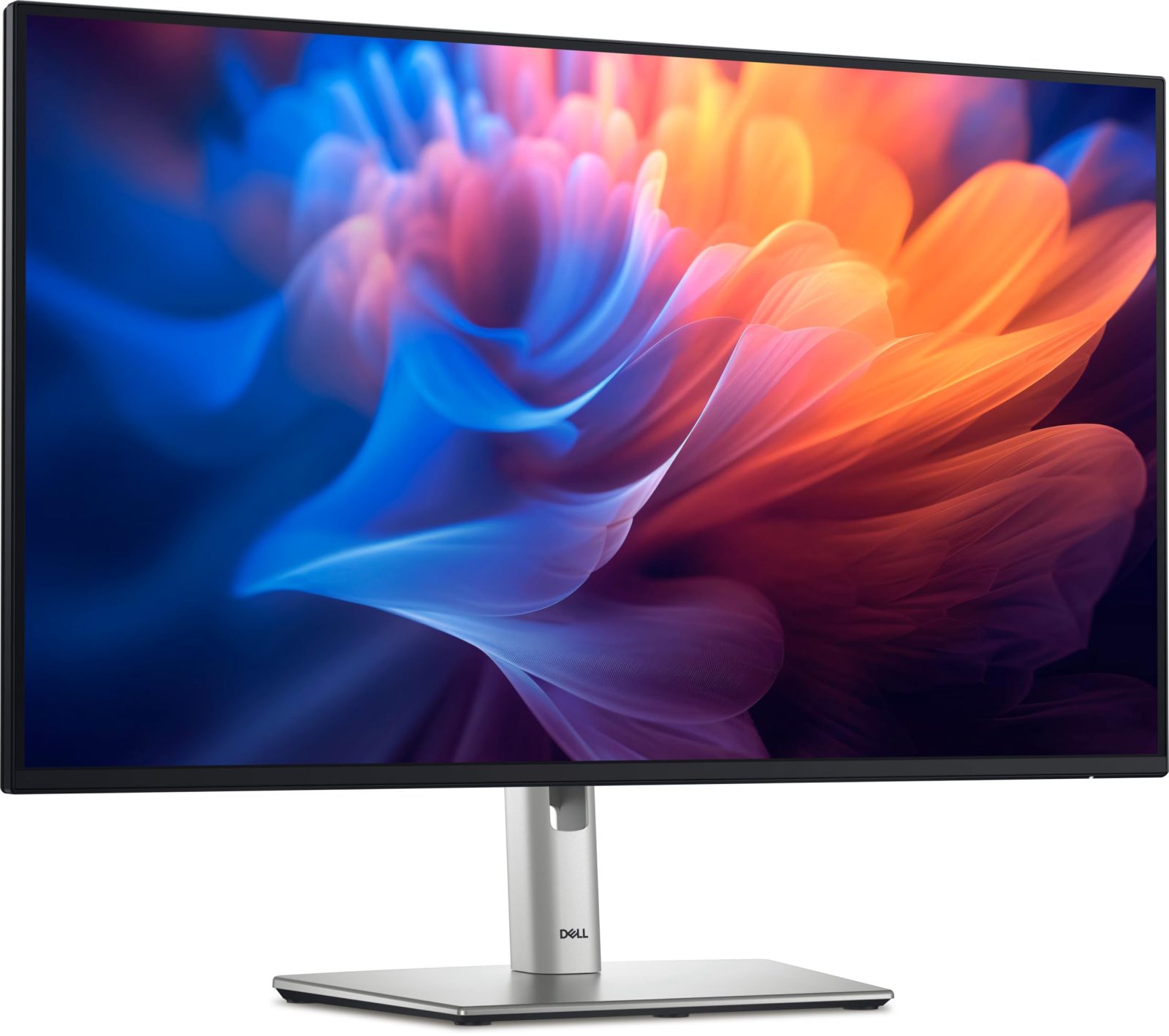
📷 Photo by amazon.it
Your workspace environment plays a massive role in how you perceive color. Neutral gray walls are preferred over bright colors because they prevent light reflection from tinting your perception of the screen. If your walls are painted a vibrant color, your eyes will naturally adjust to that ambient hue, causing you to over-correct your images. Investing in a monitor hood is another simple yet effective way to block stray light and increase the perceived contrast of your display.
The Role of Bit Depth
For those working in high-dynamic-range (HDR) or complex color grading, bit depth is essential. An 8-bit monitor can display 16.7 million colors, but a 10-bit monitor can display over one billion. This higher bit depth prevents “banding” in gradients, such as those found in sunsets or skies. When paired with a professional graphics card that supports 10-bit output, you will notice significantly smoother transitions between color shades.
Frequently Asked Questions
Q: Do I need a hardware-calibratable monitor if I am just starting out?
A: While high-end hardware-calibratable monitors are the gold standard, a mid-range IPS monitor with good sRGB coverage is sufficient for beginners. Focus on color accuracy once your work begins to reach clients or print houses.
Q: How often should I calibrate my display?
A: For professional output, calibrate your monitor once every two to four weeks. If you work in a high-stress environment with fluctuating temperatures, calibrate more frequently to account for color drift.
Q: Is 4K resolution necessary for color work?
A: 4K is not strictly required for color accuracy, but it is highly recommended for digital artists. Higher pixel density allows you to see fine details and artifacts that would be invisible on a standard 1080p display, leading to cleaner final exports.
Ultimately, the best monitor is one that removes the guesswork from your workflow. By prioritizing color gamut coverage, uniformity, and regular calibration, you ensure that the image you see on your screen is exactly what your audience sees, regardless of the device they use.
📷 Photo by re.now