





Innerspark.us – Choosing between matte, glossy, and luster finishes depends on your specific lighting environment, the level of detail in your artwork, and the desired tactile experience for the viewer. Matte provides a glare-free, organic look, glossy offers maximum color vibrancy and sharpness, and luster serves as a versatile professional balance between the two.
Understanding the Core Differences
The finish of a fine art print is more than just an aesthetic choice; it influences how light interacts with the surface and how the viewer perceives color depth. Understanding the physical characteristics of each paper type is the first step in ensuring your work looks exactly as you intended.
Matte finishes are characterized by a flat, non-reflective surface that absorbs light rather than reflecting it. This makes them ideal for environments with harsh overhead lighting or window glare, as the image remains visible from any angle. Because there is no reflective coating, matte prints often exhibit a softer, more painterly quality, making them a popular choice for black-and-white photography, charcoal sketches, or art prints with heavy texture.
Glossy finishes, by contrast, feature a smooth, high-shine surface that sits on top of the paper fibers. This coating acts like a magnifying glass, enhancing the micro-contrast and saturation of the ink. Colors appear more vivid, and blacks look deeper because the light is reflected back to the viewer with minimal scatter. However, the high reflectivity can be a significant drawback in bright rooms, often creating distracting glare that makes it difficult to view the details of the image.
Luster, often referred to as satin or semi-gloss, sits in the middle of the spectrum. It has a fine, pebbled texture that mimics the surface of traditional darkroom prints. This finish provides the color punch of glossy paper while diffusing light just enough to prevent the harsh glare associated with high-shine surfaces. It is widely considered the industry standard for professional portraiture and wedding photography.
Comparative Analysis of Print Finishes
| Feature | Matte | Luster | Glossy |
|---|---|---|---|
| Reflectivity | None/Low | Moderate | High |
| Color Vibrancy | Soft/Muted | High | Excellent |
| Glare Resistance | Excellent | Good | Poor |
| Fingerprint Resistance | High | High | Low |
| Best Use Case | Fine Art/Drawings | Portraits/Exhibits | Commercial/Detailed |
Common Pitfalls When Selecting a Finish
One of the most common mistakes artists make is assuming that “more detail” always requires a glossy finish. While glossy paper does hold detail well, modern matte papers—particularly those made from cotton rag—can hold intricate detail just as effectively while providing a more sophisticated, high-end feel. Choosing glossy for a large-format landscape print intended for a sunlit living room is another frequent error, as the glare will likely obscure large portions of the image.
Another factor to consider is the display method. If you intend to frame your prints behind glass or acrylic, the finish becomes slightly less critical regarding glare, as the glass will dictate the reflection. However, placing a glossy print behind glass can lead to “Newton’s rings” or unwanted sticking between the print surface and the glazing. In these cases, matte or luster is almost always the superior choice to ensure longevity and visual clarity.
Step-by-Step Guide to Choosing Your Finish
- Assess the lighting conditions where the print will be displayed. If it is a bright, sun-drenched room, prioritize matte to avoid glare.
- Evaluate the color palette of your artwork. High-contrast, neon, or vibrant saturated images benefit from the color-popping capabilities of glossy paper.
- Consider the handling requirements. If the print will be handled frequently without a frame, avoid glossy, as it is highly susceptible to fingerprints and scratches.
- Order a test strip or a sample pack. Print a small section of your image on all three surfaces to see how the ink interacts with the specific paper base.
- Finalize your decision based on the intended mood; matte feels organic and tactile, while glossy feels modern and crisp.
The Role of Texture and Paper Weight
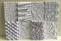
Beyond the finish, the base material—whether it is alpha-cellulose, cotton rag, or resin-coated paper—plays a role in how the final product feels. Matte papers often have a visible tooth or texture that adds a tactile dimension to the print. This texture can be incredibly effective at hiding minor imperfections and making the print feel more substantial and artisanal.
Resin-coated (RC) papers, which are commonly used for glossy and luster finishes, are plastic-coated on both sides. This makes them highly durable and resistant to curling, which is a major benefit for photographers who need to ship prints or mount them quickly. Cotton rag papers, which are typically matte, are more delicate but offer superior archival qualities, often lasting for decades without yellowing or degradation.
Maintaining Your Prints
Regardless of the finish you choose, proper maintenance is essential. Always handle prints by the edges, especially with glossy surfaces, as skin oils can permanently mark the coating. If you must frame your prints, ensure that you use acid-free materials to prevent chemical reactions that could discolor the paper over time. For matte prints, keep them in low-humidity environments to prevent the paper fibers from expanding and contracting, which can cause the print to lose its flatness.
Frequently Asked Questions
Q: Which finish is best for professional photography?
A: Luster is generally considered the best all-rounder for professional photography because it offers professional-grade color saturation while minimizing the distracting glare found in glossy prints.
Q: Can I use matte paper for high-detail architectural shots?
A: Absolutely. High-quality matte fine art papers, such as those made from 100% cotton, have a high D-max, meaning they can produce deep blacks and crisp edges that rival glossy finishes without the distracting reflections.
Q: Why does my print look different on paper than on my screen?
A: Screens are backlit and use light to create color, while prints rely on reflected ambient light. Using a calibrated monitor and installing the correct ICC profile for your chosen paper finish will help bridge the gap between your digital file and the physical print.
Ultimately, there is no single “correct” choice. The best finish is one that aligns with your artistic vision and the practical requirements of the space where the art will live. By experimenting with different finishes, you can elevate your work from a simple digital file to a tangible, museum-quality piece of art.
📷 Photo by lollipopprint.co.uk