





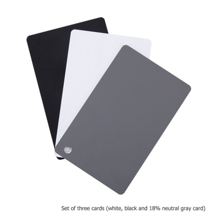
Innerspark.us – A white balance grey card is a neutral reference tool that allows digital sensors to calibrate color temperature accurately, ensuring that artwork reproductions display true-to-life hues without unwanted color casts. By capturing a reference shot with this card under specific lighting, photographers can neutralize color shifts during post-processing to achieve perfect color fidelity.
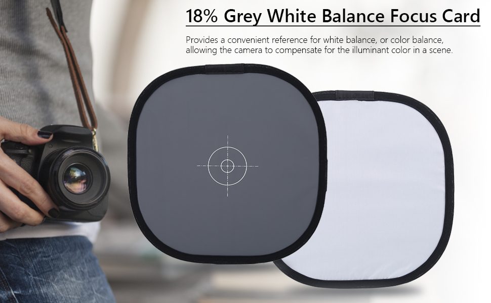
📷 Photo by amazon.ca
Why Color Accuracy Matters for Artwork
When photographing fine art, the primary goal is to represent the artist’s original intent. Even slight shifts in color temperature—such as a warm orange tint from incandescent bulbs or a cool blue cast from natural window light—can ruin the integrity of a painting or print. When a viewer looks at a digital reproduction, their brain expects to see the exact pigments the artist applied to the canvas. If the white balance is off, the entire mood, depth, and contrast of the artwork are compromised.
The human eye is remarkably good at compensating for different light sources, a process known as chromatic adaptation. A digital camera sensor, however, lacks this intuition. It records light exactly as it hits the sensor, often resulting in muddy shadows or unnatural highlights. Using a grey card acts as a mathematical anchor for your image editing software, telling it exactly what “neutral” should look like in that specific environment.
Understanding the Neutral 18% Grey
The industry standard for a grey card is 18% reflective grey. This specific shade represents the middle point between pure black and pure white, which is roughly how the human eye perceives the average brightness of a scene. While white balance cards are often white, “grey” cards are superior for artwork because they provide a mid-tone reference that helps the camera determine both exposure and color balance simultaneously.
If you use a pure white card, you risk “clipping” the highlights, where the sensor records the white as pure data without any texture. A grey card avoids this issue, providing a reliable surface that the software can easily read to calculate the Kelvin temperature and tint values needed to normalize the image.
Comparison of Color Correction Methods
| Method | Accuracy Level | Ease of Use | Best For |
|---|---|---|---|
| Auto White Balance | Low | High | Casual snapshots |
| Preset Kelvin | Medium | Medium | Consistent studio lighting |
| Grey Card Reference | High | Medium | Professional art reproduction |
| Color Checker Passport | Maximum | Low | Museum-grade archiving |
Step-by-Step Guide to Using a Grey Card for Art
Follow these steps to ensure your artwork is captured with scientific precision every time you set up your camera.
- Place the grey card directly over the artwork or hold it in the exact same lighting plane as the surface of the art.
- Take a test shot of the card filling the frame, ensuring it is evenly lit without any glare or shadows cast by your body.
- Proceed to photograph the artwork without moving the lighting setup or changing your camera settings.
- Import your images into your editing software, such as Lightroom or Capture One.
- Select the “White Balance Selector” tool (often an eyedropper icon) and click on the grey card in your test shot.
- Copy the white balance settings from the test shot and sync them across all the photos taken of the artwork in that session.
Common Mistakes to Avoid
One of the most frequent errors is allowing the grey card to reflect light sources directly. If your studio lights are bouncing off the matte surface of the card, you will get a “hot spot” that provides an inaccurate reading. Always angle the card slightly to avoid glare, or use a matte-finish card rather than a glossy one.
Another common mistake is changing the lighting after you have captured the reference shot. If you move a light or add a second source, the color temperature of the entire scene changes. You must re-capture the grey card reference every time the lighting configuration is modified. Failure to do so will result in color casts that are difficult to fix manually in post-production.
The Role of Lighting Quality
Even with a perfect grey card, poor quality light can hinder your results. “Color Rendering Index” (CRI) is a measure of how accurately a light source reveals the true colors of objects. If you use cheap LED lights with a low CRI, the light simply lacks the full spectrum of colors. A grey card can fix the white balance, but it cannot “create” color data that was never there to begin with. Always invest in high-CRI lighting (95+) when photographing fine art to ensure that the reds, blues, and yellows in the painting are actually present in the light hitting the canvas.
Frequently Asked Questions
Q: Can I use a piece of white paper instead of a professional grey card?
A: It is not recommended. Most office paper contains optical brighteners that reflect UV light, which can create a blue cast in your final image. A professional grey card is spectrally neutral and designed specifically to reflect all colors equally.
Q: Does the grey card need to be in every single photo?
A: No. You only need to capture the grey card once for every lighting setup. As long as the lights and the camera settings remain unchanged, you can apply the same white balance correction to every image in that series.
Q: How do I store my grey card to keep it accurate?
A: Keep your card in a protective sleeve away from direct sunlight and dust. If the card becomes scratched or dirty, its reflective properties change, and it may provide an inconsistent color reference over time.
Final Considerations for Professional Results
Achieving 100% accurate color is a journey that combines hardware tools with disciplined workflow. While the grey card is the most cost-effective and efficient way to achieve professional results, remember that your monitor must also be calibrated. If your screen is not displaying colors correctly, you will be making adjustments based on false information. Pair your grey card workflow with a monitor calibration device to close the loop on your color management process. By maintaining a clean, neutral, and consistent environment, you ensure that the artwork you photograph today will look exactly as the artist intended for years to come.
📷 Photo by teleton.org.hn