




Innerspark.us – Daylight balanced bulbs at 5600K mimic the cool, crisp color of midday sun ideal for color accuracy in studio art photography, while 3200K bulbs provide a warmer, golden hue that mimics traditional tungsten lighting for mood and artistic depth.
Choosing between 5600K and 3200K lighting is one of the most critical decisions an art photographer makes. The Kelvin (K) scale measures the color temperature of light, and understanding how these values interact with pigments, textures, and camera sensors determines whether your final image looks professional or requires extensive color correction.
Understanding Color Temperature in Art Reproduction
Art photography requires a high degree of fidelity. When you photograph a painting or a sculpture, the viewer expects the colors on their screen or print to match the original piece. 5600K is considered “daylight balanced” because it approximates the color of the sun at noon. This temperature is neutral, meaning it does not lean heavily toward blue or orange, making it the industry standard for color-critical work.
Conversely, 3200K sits at the warmer end of the spectrum. It mimics the glow of incandescent light bulbs. While this light can make skin tones look flattering or add a cozy atmosphere to a lifestyle photo, it can wreak havoc on an art reproduction. It introduces a yellow or amber cast that makes cool blues, greens, and purples look muddy or shifted.
When to Use 5600K (Daylight)
You should prioritize 5600K bulbs when your primary goal is color accuracy. If you are photographing fine art for a catalog, a gallery website, or an archival record, daylight-balanced light ensures that the white balance of your camera stays consistent. This light cuts through the tendency for colors to look dull, providing a clean, crisp illumination that highlights the texture of brushstrokes or the grain of a canvas.
When to Use 3200K (Tungsten)
3200K is rarely used for flat-lay art reproduction, but it serves a purpose in artistic portraiture or still-life photography where the mood of the light is more important than the literal accuracy of the colors. If you are photographing an artist in their studio and want to capture the “vibe” of their creative process, the warm glow of 3200K bulbs can create a sense of intimacy and nostalgia that 5600K light might strip away.
Technical Comparison of Lighting Temperatures
| Feature | 5600K (Daylight) | 3200K (Tungsten) |
|---|---|---|
| Color Appearance | Crisp, cool white | Warm, golden yellow |
| Primary Use | Art reproduction, product shots | Mood lighting, portraiture |
| White Balance Setting | Daylight / 5600K | Tungsten / 3200K |
| Atmosphere | Energetic, clinical, accurate | Cozy, nostalgic, dramatic |
Common Pitfalls and Risks
The most common mistake photographers make is mixing light sources. If you have a window letting in 5600K daylight and you supplement it with a 3200K lamp, your camera will struggle to find a consistent white balance. This results in “mixed lighting,” where one side of your artwork looks blue and the other looks orange. It is nearly impossible to fix this in post-processing without losing detail in the shadows or highlights.
Another risk is the Color Rendering Index (CRI). Regardless of whether you choose 5600K or 3200K, you must ensure your bulbs have a high CRI (95+). A bulb might be the right temperature, but if it has a low CRI, it will fail to render certain pigments correctly, leading to dull, lifeless images that lack the vibrancy of the actual artwork.
Steps to Setting Up Your Lighting
- Clear your studio space to ensure no stray ambient light from windows or ceiling fixtures interferes with your controlled lighting setup.
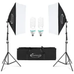
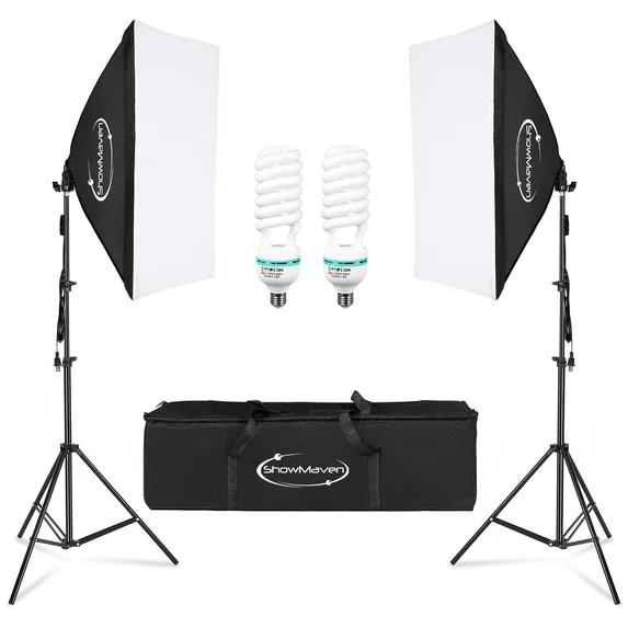
- Mount your chosen 5600K bulbs in softboxes or umbrellas to diffuse the light, which prevents harsh glare on glossy paintings or metallic sculptures.
- Position your lights at 45-degree angles to the artwork to eliminate reflections and minimize shadows across the surface.
- Set your camera’s white balance manually to 5600K (or use a grey card for precise calibration) to ensure the sensor interprets the light correctly.
- Take a test shot and check the histogram to ensure no highlights are blown out and the colors appear natural to your eye before proceeding with your full session.
Managing Light Intensity
Beyond color temperature, you must consider the intensity of the light. For fine art, use a light meter or your camera’s internal histogram to ensure even distribution. If you are using 5600K LEDs, they are often dimmable, allowing you to control the exposure without changing the color temperature. This is a significant advantage over older incandescent bulbs, which change color as you dim them.
If you find that your 5600K lights feel too “clinical,” do not be tempted to switch to 3200K. Instead, adjust your contrast and saturation in post-production. It is always better to start with a color-accurate, neutral file than a file that has been baked with an artificial yellow tint that is difficult to remove.
FAQ
Q: Can I use both 5600K and 3200K bulbs in the same photo shoot?
A: Generally, no. Mixing color temperatures creates inconsistent lighting that is extremely difficult to correct during editing and will ruin the color accuracy of your art photography.
Q: Does 5600K light make colors look fake?
A: No, 5600K is designed to be neutral. If colors look “fake” or “too blue,” it is likely because your camera’s white balance is set incorrectly or the bulb has a low CRI rating that fails to reproduce the full spectrum of colors.
Q: Are LED bulbs better than traditional bulbs for art photography?
A: Yes, high-CRI LED bulbs are preferred because they produce very little heat, which protects the artwork, and they maintain a consistent color temperature regardless of the brightness level.
By sticking to the 5600K standard for your professional art photography, you ensure that the work you capture is represented exactly as the artist intended. While 3200K has its place in creative lighting, precision and accuracy are the hallmarks of a successful art portfolio. Always prioritize high-CRI bulbs to ensure that every shade and hue is captured with the depth and clarity it deserves.
📷 Photo by walmart.com